Designing an MVP for Start-up Success in Augmented Reality
COMPANY: Happy Compass (Start-Up) ROLE: UX Researcher & UX Designer TIMINGS: Aug-Oct 2023
A start-up with a vision in the health and wellness industry wanted to create an augmented reality app using gamification to boost mental well-being. Users aim to improve their avatars' health, teaching them healthier lifestyle habits in the process.
With a team of a psychologist, scientist, and analyst, they sought my expertise to design an intuitive user flow to engage the user, teach them how to use the app and encourage sign-up/subscription.
Start with learning from the best and identifying the worst. Understand what competitors are doing right, what could be done better and what industry standards exist that we want to emulate. As we didn’t have a prototype to test, I dug deep into the user journeys of existing apps and services to understand what opportunities exist and build a user flow that works for the business proposition and the target audience.
My Strategy
The team had already conducted market research and understood their target audience and their main competitors. The company wanted to market the product as an Employee Assistance Program. As I didn’t have access to other EAPs I analysed 4 competitors that offer EAP’s who had accessible mobile apps: Headspace, Calm, Happify and Alan Mind. I also looked at Pokémon Go, as this app was a leader in bringing augmented reality to larger audiences.
Competitor Analysis
Mapping the User Flow
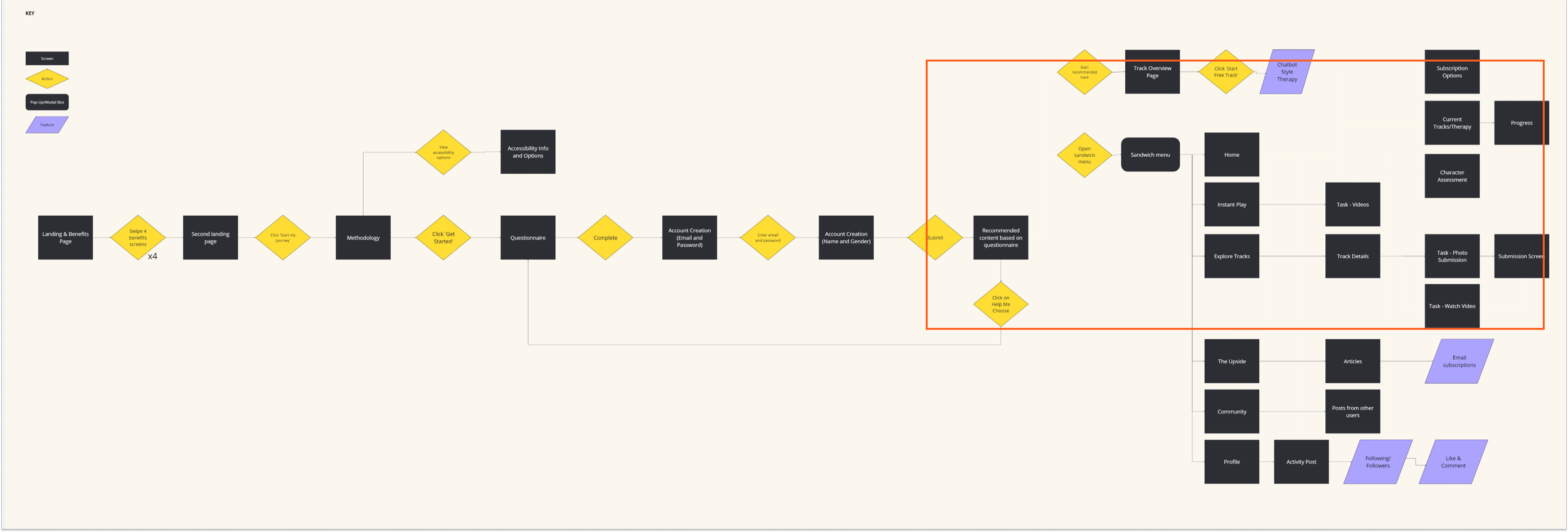
After reviewing each of the competitors service offerings I mapped the user flow of each app using the screens. There are 7 main steps on the user journey, including account creation, subscription options/sign-up, benefits overviews, personal questionnaire and recommended content.

There were 7 commonalities in the user journey. Each app took a different approach and used a varying number of screens to complete the journey.

Headspace and Happify had a similar number of screens to view before accessing content, however when looking at important user actions, such as creating an account and subscription, Happify took almost 10x as long.
By mapping out the user journey milestones, I gained insights into common user paths across competitors and identified key screens for highlighting UX design best practices.
Crucially, this analysis revealed an opportunity to streamline development by creating a single app for both B2B and B2C customers, with just one additional step for B2C users. This approach saved the team significant time and effort, avoiding the need to develop separate applications for each market segment.


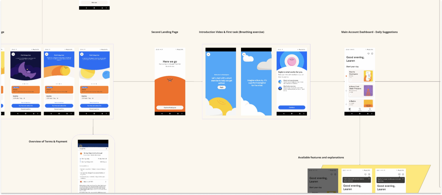
Pictured: The user flow and a snapshot of the detailed screen map for Headspace.
Pictured: The user flow and a snapshot of the detailed screen map for Happify.
UX Design Standards
Based on the user flows for each competitor app and the goals of Happy Compass, the following stages were the most important for the user journey. These were the screens I reviewed to understand UX design best practice.
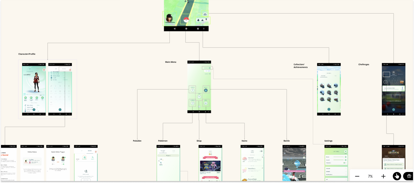
Additionally, I reviewed key screens from the Pokémon Go user flow that would help with design of the game (e.g. task completion and instructions screens).
01
Landing Page & Benefits Overview
A visually appealing and very clear message about why you should use this service.
02
Needs Questionnaire
A must-have for the product as the company wanted to offer personalised health advice.
03
Account Creation
The revenue stream for B2C customers would come from in-app purchases, so account creation needed to be smooth, quick and easy.
04
Recommended Content
This was especially important due to the nature of the service, users had to return to the game and understand why they were being asked to complete certain tasks.


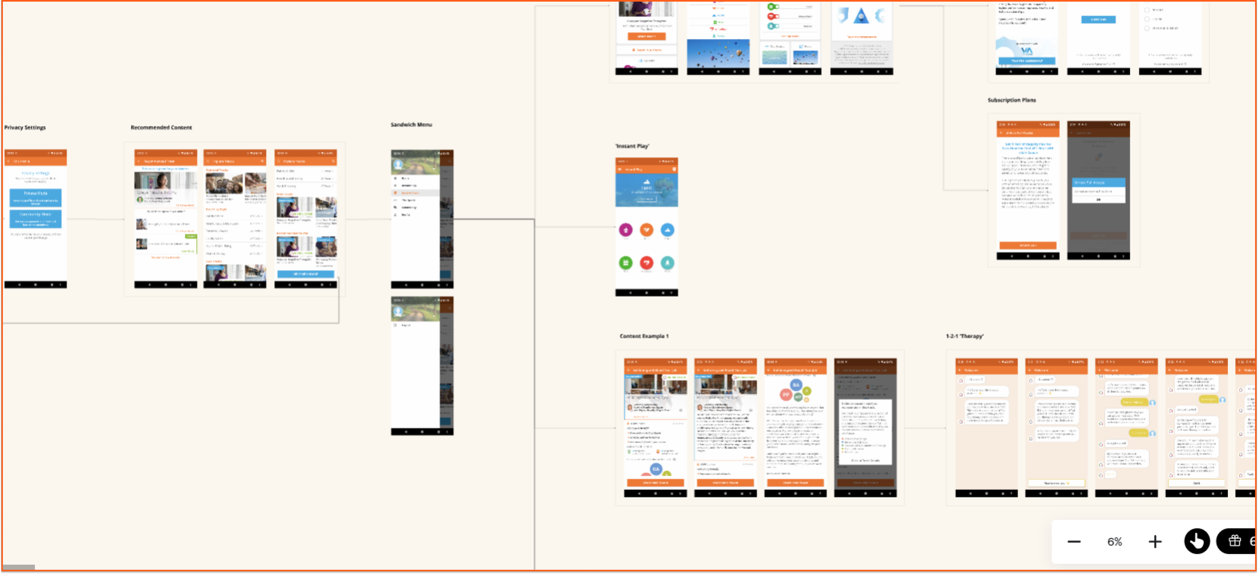
Wireframing
I recommended a user flow for the app that aligned with both competitor analysis and the product’s goals, which the team readily approved. I then developed low-fidelity wireframes for discussion. Through collaborative workshops we refined the flow to incorporate essential gameplay screens, such as augmented reality instructions, challenge descriptions, and task completion screens.
To ensure alignment with the design best practices identified in the competitor analysis, I annotated the wireframes for the developers, guiding them in implementing these crucial design elements.


Pictured: Snapshots of the sketches/low fidelity wireframes and annotated screens.
Lessons Learnt
In this project, I faced the challenge of gathering user feedback without access to Employee Assistance Programs (EAPs) and zero budget. To overcome this, I employed a resourceful approach by analyzing user complaints on Reddit and various online forums. This allowed me to identify key opportunity areas by understanding pain points with existing products.
I also learned the importance of adaptability, particularly when managing multiple roles simultaneously. Additionally, I honed my ability to communicate complex technical or specialized knowledge to stakeholders who were outside the industry or unfamiliar with the subject matter, ensuring clear and effective collaboration.
